




B.I & Space Design
GOOSLES
GOOSLES는 구슬 아이스크림을 전문으로 판매하는 캐주얼 F&B 브랜드입니다.
Project : Re-Branding & Interior Design
Location : Seoul, Korea
Client : GOOSLES
Venue : Seoul
Project Period : 2026. 03. -
구슬스(GOOSLES)는 원하는 맛을 직접 골라 담는 구슬 아이스크림 데일리 디저트 브랜드입니다. 아이스크림이라는 카테고리가 오랫동안 어린이의 간식으로 소비되어온 것과 달리, 구슬스는 일상의 모든 순간에 세대 구분 없이 즐기는 브랜드를 지향합니다. 이번 리브랜딩은 그 지향점에 맞춰 브랜드가 축적해온 즐거움의 정서는 유지하되, 이를 담아내는 시각 언어를 보다 동시대적인 완성도로 끌어올리는 데서 출발했습니다.
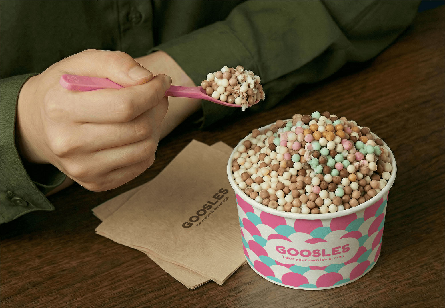
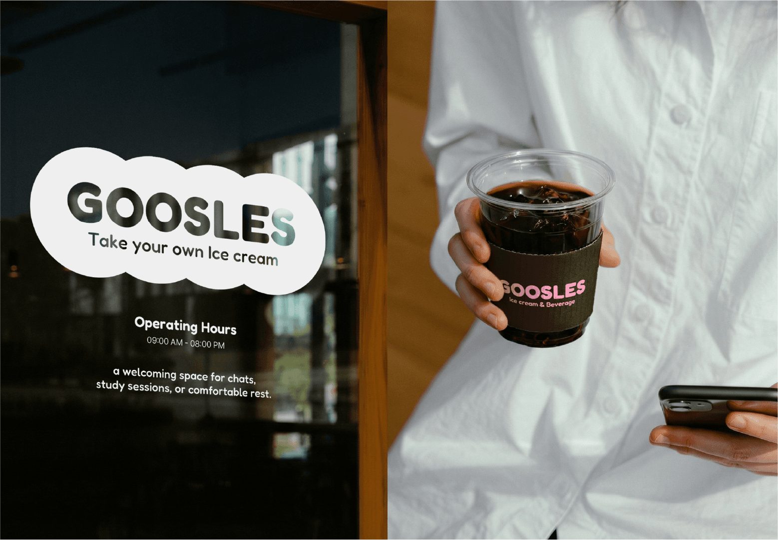
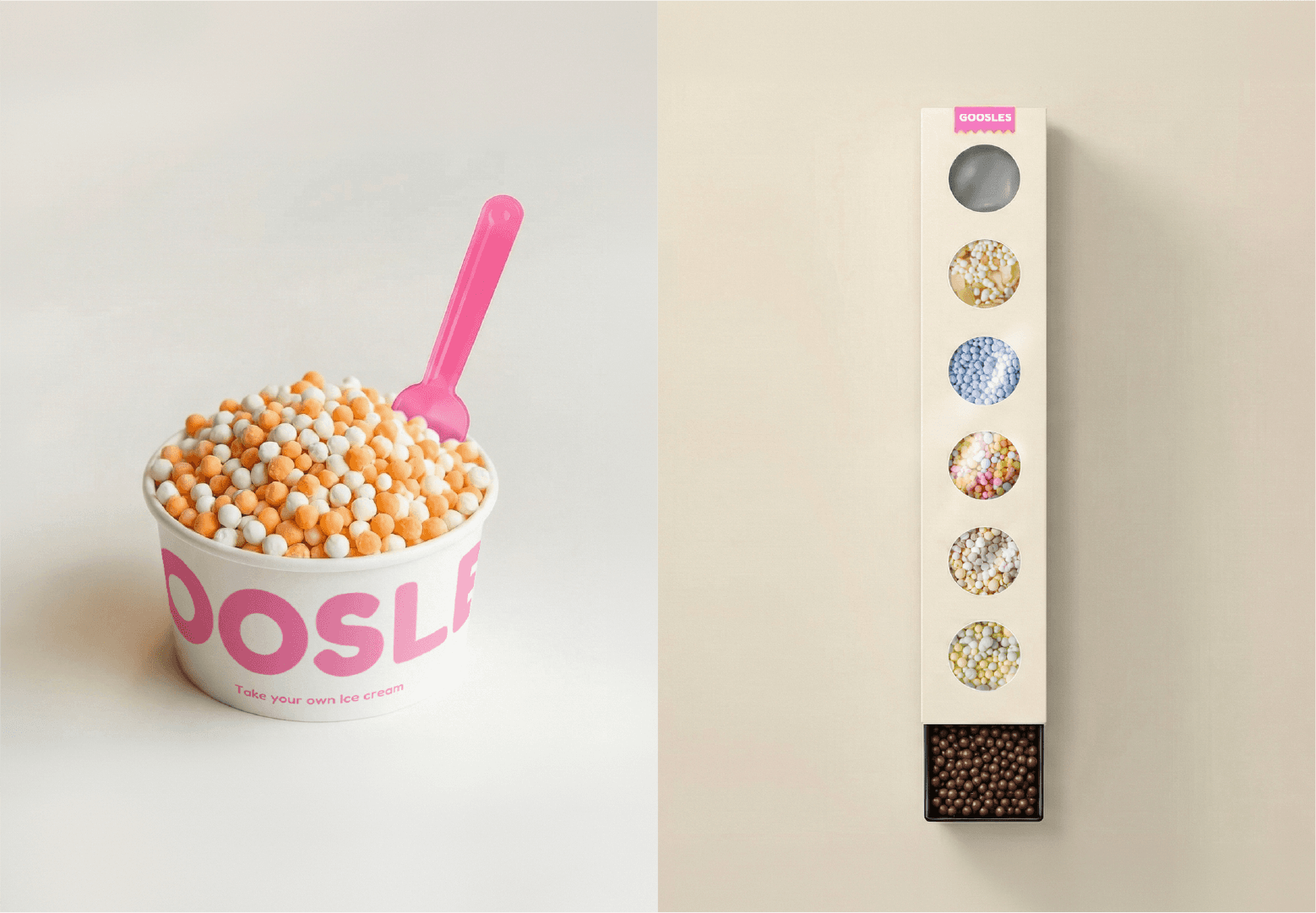
Studio id(r)eal은 이번 구슬스 리브랜딩에서 '정제된 즐거움'에 주목했습니다. 다색 배색과 장식적 외곽선으로 유아적 인상에 머물러 있던 기존 로고 타입을, 구슬의 형태 언어만 남긴 단일 색상의 기하학적 워드마크로 재구축해 가독성과 확장성을 확보했습니다. 브랜드 컬러는 아이스 핑크 단일 주조색과 커피 딥 그레이 스케일로 체계화하고, 구슬이 흩어지는 순간의 질감을 프로스티드·새틴 그라데이션으로 번역해 색을 덜어내면서도 브랜드 고유의 온도를 잃지 않도록 했습니다. 워드마크의 원형 모듈에서 파생된 캐릭터와 클라우드 심벌은 패키지, 사이니지, 공간의 조명과 가구 형태로 일관되게 확장되어, 로고에서 매장에 이르는 모든 접점이 하나의 형태 논리 위에서 작동합니다. 이를 통해 구슬스가 특정 세대의 취향에 갇힌 브랜드가 아니라, 누구의 일상에나 자연스럽게 놓이는 브랜드로 나아가는 기반을 마련하고자 했습니다.
GOOSLES is a daily dessert brand centered on bead ice cream, where customers pick and mix their own flavors. While ice cream has long been consumed as a category confined to children's treats, GOOSLES aspires to be a brand enjoyed across generations, in every moment of daily life. This rebranding began with that aspiration: preserving the sense of joy the brand has accumulated, while elevating its visual language to a level of contemporary refinement.
For the GOOSLES rebranding, Studio id(r)eal focused on the idea of refined joy. The former logotype, which had remained childlike in impression with its multicolored palette and decorative outlines, was rebuilt into a single-color geometric wordmark that retains only the formal language of the bead, securing both legibility and scalability. The brand colors were systematized into a single primary Ice Pink and a Coffee Deep Gray scale, while the texture of beads scattering was translated into frosted and satin gradients—reducing color without losing the brand's inherent warmth. The character and cloud symbol, derived from the circular modules of the wordmark, extend consistently into packaging, signage, and the lighting and furniture of the space, allowing every touchpoint from logo to store to operate on a single formal logic. Through this, we sought to lay the foundation for GOOSLES to move beyond a brand confined to the taste of a particular generation, toward one that sits naturally in anyone's everyday life.